Thursday, December 13, 2012

Lab 8: Analysis of L.A.'s Station Fire


Map 1.


Map 2.


Map 3.


The Station Fire was Los Angeles County’s largest forest fire, with an estimated 160,577 total acres burned1. Weather conditions in the area were very warm and extremely dry. In addition, there was plenty of “dense, dry brush [that was] easily ignitable”2. These weather conditions that symbolize the peak of fire season are common around the late Summer and early Autumn months that. Fire season in Southern California is well known, but the magnitude of the blaze was shocking. The spread of the fires, beginning with the early extent shows a fire movement in the North direction. Although much of the fire burned in the mountains of the L.A. County Forest, foothill neighborhoods and cities to the South were also threatened.
Map 1 shows L.A. County and its boundary. The map is a digital elevation model showing relatively the areas of higher and lower elevations-the purple areas are near sea-level and the white areas are the highest elevations in the county. This map shows the extent to which the fire spread at particular intervals over a five-day period, in blue, green, and yellow. Based on the central position of the fire outbreak in L.A. County and the color gradient of the map, you can tell that the topography is quite unsteady and rough.
Map 2 is a zoomed-in look of the area where the Station Fire started, and most of its spread, with a 5 kilometer buffer zone(gray) around the fire perimeter. This buffer zone is an unofficial representation of the plume from the smoke, which is hazardous to citizens living in the area. Moreover, living or working just outside 5 km buffer zone from a wildfire, should be alarming enough. Cities within the buffer zone are noted; they include La Crescenta-Montrose, La Canada-Flintridge, and Altadena. City officials located inside the plume should be well informed of the threat and should have both State and Federal resources to aid in the emergency response.
Map 3 illustrates crucial information to both citizens as well as city officials. Included on the map are seven hospitals/sanitariums that would be greatly affected, if not closed in their entirety, due to the fire/smoke danger. They include Pacoima Memorial Hospital, Lakeview terrace Sanitarium, Hillcrest Sanitarium, Verdugo Hills Hospital, La Vina Hospital and Sanitarium, Pacoima Hospital, and Altadena Hospital. The interstate highways that maneuver inside the buffer zone includes the I-210 freeway from Pacoima Memorial Hospital east to Altadena, and the northern portion of the S-2 freeway. Alternative freeways to be used are the 134 freeways, which runs from the I-210 in Old Pasadena west to the I-5 freeway.


Bibliography

1 NOAA National Climatic Data Center, State of the Climate: Wildfires for Annual 2009, published online December 2009, retrieved on December 11, 2012 fromhttp://www.ncdc.noaa.gov/sotc/fire/2009/13.

2 Fire and Aviation Management: Station Fire Initial Attack Review. Rep. United States Department of Agriculture, 13 Nov. 2009. Web. 10 Dec. 2012. <http://www.fs.fed.us/fire/station_fire_report.pdf>.

Monday, November 26, 2012

Lab 7: Using Census 2000 Data

The map above is a map showing the distribution of Black people living in the United States, according to data from the U.S. Census of 2000. The largest populations are in The South-with a large concentrated area in the Lower Mississippi Delta region. Additionally, there are cities in the Midwest and Northeast that show larger black populations. The range of percentage of the total population is 0-86.5%.


The map above is a map showing the distribution of Asian people living in the United States, according to data from the U.S. Census of 2000. The Asian population of the United States are located in small areas of the U.S., mostly along the East and West coasts. The biggest concentrations of Asian people exist in Southern California and the Bay Area. The Asian population appears to be the least widespread of the racial groups I mapped. The range of percent of the total population is 0-46%.


The map above is a map showing the distribution of "Some Other Race" people living in the United States, according to data from the U.S. Census of 2000. I assume that "Some Other People" is a representation of the Latino distribution; Much of the higher concentration of "Some Other Race" is located around the Southwest border region. The highest concentrated areas are in California, New Mexico, and Texas. The range of percent of the total population is 0-40%.

Using Census data to create maps is a great source of free and public data. The data is more than 10 years old so the map is definitely a bit misrepresentative of the United States' racial makeup of today. There are some errors in the maps above where some counties have no officially reported information. This missing data appears as white on the maps in the counties that have no inputed data. The percentage of total race data is interesting information to map. However, it is important to note that this map doesn't show the areas with the most people of a particular race. Shown are the areas with the most people of a particular race in relation to the total population in a county. 

My overall experience using ArcGIS to produce maps has been both stressful and enlightening. This lab was pretty simple and similar to the assignments we've completed before. We learned how to join Census data to an already existing data set. We also were introduced to working and editing data in a set in order to make it compatible with the ArcGIS software. This set up the issue of making sure the data is joined correctly. I am impressed with the variety of uses this software has made thus far. I can say I'm no longer afraid of ArcGIS, and I feel more comfortable creating maps.


Monday, November 19, 2012

Lab 6: DEM's in ArcGIS

Digital Elevation Models 


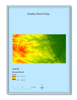
Making digital elevation maps (DEM'S) in ArcGIS is a great way to broaden your outlook on the potential this software has at visually displaying information. My favorite DEM's are the shaded relief and the 3D maps. They are aesthetically pleasing and present easy to understand information about the elevation distribution of this area. The use of ArcGIS to create these varied DEM's was easy, while the creation of the original map proved to be the hardest step. Additionally, the software allows for the user great potential in making creatively informative maps. I experienced no pitfalls in using the software, however there is the potential for picking color scale and gradients for the map data that don't represent it in a "user-friendly" way. Examples include visual conventions, such as blue for water, that are easily understood. Overall, working with various digital elevation maps provided a good understanding of the different ways elevation can be observed and understood.

Monday, November 12, 2012

Lab 5: Projections in ArcGIS


I found this lab to be interesting and insightful.  It was seemingly easy at first to follow the directions; I did not grasp the the overall concept of what was being asked of me until I applied the different of types of maps to create the projections.  I was under the impression we were projecting some unknown fact or looking to display only a certain kind of data, when in reality we were doing that, just in a simple way-using different map displays to represent the same information, in our case distance.  

I was unable to get varying measurements for ranges in distance. I got the same, actual distance for all of my projections although they should have been different. If the measurements were taken based off of the projections, my distances would have been accurate. I found myself asking questions like what projections are useful for different industries, like aviation, aerospace, and government for example.   

The imaging of the regions of the world is also fascinating to manipulate with different map projections.  For example, Alaska looks small and distorted on the sinusoidal map projection, but it looks larger and "normal" in the Mercator projection. The representations of surfaces in different methods lead to different conclusions about the area being analyzed. 

I found the lab interesting, but somewhat difficult, until I figured out how to make the actual map. It was also hard to choose between the large variety of map projections that ArcGIS has available. Map projections are useful in representing different types of data, even though the many types of projections can present issues. 

Monday, November 5, 2012

Lab 4 Introducing ArcMap

Introducing ArcMap


This map was created using ArcMap, which is the main component of the ArcGIS software. It is a geospatial processing program that helps in organizing, editing, and analyzing geographical information. I've found that it is a great program because of its many functions. Following the instruction in the tutorial was difficult, but I was able to perform various tasks such as importing data, analyzing different attributes, editing the map and exporting the final map. Also, the editing tools of ArcGIS helps users to draw accurate lines and curves and hence reduce mistakes caused by a lack of drawing skills. In addition, accurate and comprehensive analysis can be done in just a few steps, and aesthetically pleasing graphs or maps can be created to present the result. 

Another merit of the ArcGIS is that it enables users to create highly customized maps. The color of different features could be changed one by one manually or by using a set style. Titles and other texts can be added and dragged to proper position. Also, there are different types of legends, scale bars and north arrows so that the user can choose the visual they think works the best. All these functions make the maps created more diverse and more eye-catching. Furthermore, ArcGIS is very convenient in the sense that any change in the data will immediately result in change in corresponding map features. The user, therefore, can see the changes directly and can respond quickly if the editing of data is mistaken.

Nevertheless, ArcGIS has pitfalls too. The biggest problem is that the program is too complicated for the beginning user. While providing plenty of functions to enhance the presentation, ArcGIS could be difficult to use, especially for people who lack basic computer skills. Many of the functions are represented by icons which are difficult to recognize and some others are only feasible to use when certain requirements are met. In comparing to the tools used in making "my maps' Google Map, ArcGIS is less accessible for the public. In addition, since it does not have the function of adding related videos or pictures to features, the map created will be less less dynamic and viewer-centric.

Overall, I have had an enlightening experience working with ArcGIS, realized that it is a useful tool for processing complex geospacial data and creating illustrative maps. However, it requires a certain level of computer skill and is quite complex with users. 


Monday, October 22, 2012

Lab 3: Neogeography


View Tourism Map of Los Angeles Beaches- Venice Beach and Santa Monica in a larger map

This map shows my ideal path for vacationers interested in seeing Los Angeles' beach culture. It is a long walk, but shows extensive parts of our coast that are really unique. Using Google Maps to create a custom route is a great way to make an easily understandable map. One features that enables ease of use is the road systems that show viable paths. Additionally, you are able to zoom in/out to see very specific features on the map.

However, Google Maps does present some challenges that may not be clearly present. For example, listing landmarks, shops and restaurants you think are in one place could actually be moved, or worse, gone altogether-data quality. Another possibility of confusion would be a new building or construction project that has altered or erased a previously known route/attraction. My map in particular does not show the ebb and flow of the tide, so the part of my map that takes viewers along the shoreline may actually take them knee-deep in seawater, depending on the time of the trip.

Sunday, October 14, 2012

Lab 2: USGS Topographic Maps


1. Beverly Hills Quadrangle.
2. The adjacent quadrangles are Canoga Park, Van Nuys, Burbank, Topanga, Venice, Inglewood.
3. It was created in 1995.
4. The North American datum was collected in 1927. The National Geodetic datum was collected from 1929. Datum collected by the USGS consists of planimetery imagery(1978) and photoinspected imagery(1995).
5. 1:24,000
6. a) 1200m
    b) 1.89 mi
    c) 2.64 in
    d) 12.5 cm
7. The contour interval is 20 feet.
8. a) Public Affairs Building- 34o 4’27”, 118o 26’15”; 34.07416666666667, 118.4375
b) Santa Monica Pier- 34o0’40”, 118o 30’; 34.01111111111111, 118.5

    c) Upper Franklin Canyon Reservoir- 118o 24’15”, 34o 7’15”; 118.40416666666667, 34.12083333333334
9. a) Greystone Mansion (560-580ft; 170-177m)
    b) Woodlawn Cemetery (140ft; 42.6m)
    c) Crestwood Hills Park (600-700ft;183-213m )
10. UTM zone: 11
11. 361472.2745076031, 3763170.113931325
12. 1000x1000= 1000000 sq. mi
13.
14. 14o
15. North to South
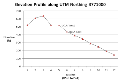
16.                                                                         UCLA 


Wednesday, October 3, 2012

Assignment 1

Exploring Maps, "Day 1"

http://www.worldmapper.org/images/largepng/19.png
http://www.worldmapper.org/display.php?selected=19

 The map above is cartogram that illustrates what countries are most traveled to. They indicate the popularity of each country, in terms of tourism. I believe this is incredibly interesting because every part of the world is unique. Every part of the world has its own "specialness", or notoriety. However, Europe, and North America and parts of industrialized Asia to some extent are most visited. Is it because of the sophisticated cityscape or the ease of access due to the modern build? Perhaps it has more to do with the colonial history and influence that has continued to affect travelers of today. I'd personally love to travel some of the countries that some may not be able to find, like Brazil and Indonesia.

 http://www.worldmapper.org/images/largepng/568.png

 http://www.worldmapper.org/images/largepng/568.png
http://www.worldmapper.org/display_religion.php?selected=568

This is another cartogram that shows the prevalance of the Buddhist religion around the world. There are 368,955,415 adherents worldwide according to "worldmapper", however the countries of Buddhist most noticeable are clustered in and around South and East Asia. Africa and South America seem to have almost no populations of Buddhists and North America and Europe are not too far ahead. I am not particular surprised by the map data. But, it is interesting to think about how readily Judeo-Christian religions have been spreading around the world compared to the more seeingly stagnant spread of Buddhist. I am a Nichiren Buddhist living in Los Angeles and I somewhat like a pioneer on the frontier of this "unexposed" territory, based on this map.


  http://www.jewishvirtuallibrary.org/jsource/images/maps/mapMEethnic.jpg
http://www.jewishvirtuallibrary.org/jsource/History/ethnicMEmap.html

The map above shows the variety of ethnic groups living in the Middle East region, in different colors. I chose this map because there has been so much social and political change in many of these countries and because I have heard of the possibility of groups seeking sovereignty/independence from the country they were drew into. I say "drew into" because much of the political borders established in this region were made by outside, and specifically by Western, nations who did not wish to draw borders on the basis of regional stability or on historical precedent. Especially Iraq and Afghanistan, where the United States coincedentally or not have been involved militarily. I believe these borders will be changing in the near future.